Text
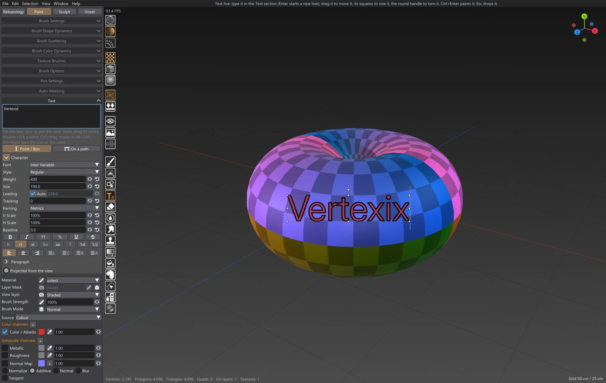
The Text tool sets type on the model. You choose the font, style, size, spacing and alignment, with the OpenType features the font has. Text can be a single line, a paragraph that wraps inside a box, or a line that runs along a curved path. In Paint it is painted onto textures or vertex colours. In Sculpt it is embossed into the surface, engraved into it, painted onto it, or made into a solid 3D mesh.
Like Shapes, the text stays live after you place it. You can retype it, restyle it, move it, size it and turn it, and nothing is painted or sculpted until you apply it.
Picking the tool
- Paint: Text is the icon under Shapes in the tool row beside the sidebar.
- Sculpt: Text is the last button in the tool row under the viewport. It puts the sculpt brush away while it is on, and picking a brush turns it off again.
Either way, the Text accordion appears in the sidebar and opens by itself. With the tool picked, a plain press in the viewport never turns the view. Ctrl or Alt + drag, or the right mouse button, still do.
Placing text
The two buttons at the top of the accordion decide what kind of text your next click makes:
| Frame | How to place it |
|---|---|
| Point / Box | Click to start point text: one line that grows from where you clicked, with a new line only where you press Enter. Drag instead to draw a box: the text wraps inside it and flows again whenever you size the box. |
| On a path | Lay the path first, then type: the text runs along it. See Text on a path. |
New text starts empty, with the caret in the accordion's text field. Type, and the words appear on the model as you type them. Enter in the field starts a new line, and Ctrl+Enter applies the text.
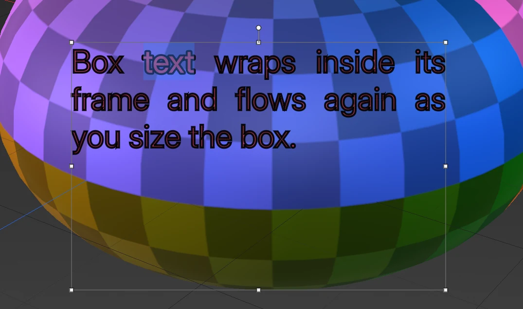
If a box is too small for its text, the lines that don't fit are left out. A red + appears at the box's corner, and a red note appears in the accordion, until the box is big enough or the text small enough.
The live text
| Do this | To |
|---|---|
| Drag the text | Move it. While you are typing, a drag selects instead, so Ctrl+drag to move it then. |
| Drag a square handle (point text) | Scale it. On release, a corner's scale goes into Size and a side's into H Scale or V Scale, so the accordion always shows what you see. |
| Drag a square handle (box text) | Size the box. The letters keep their size and the lines flow again. |
| Drag the round handle above it | Turn it. Shift turns in steps of 15 degrees. |
| Ctrl+Enter, Enter (with the text field not in use) or Apply | Apply it. The tool and its accordion stay, ready for the next text. |
| Click beside the text (Paint) | Paint it and start new text where you clicked. |
| Esc or Drop | Throw it away. While you are typing, the first Esc undoes this round of typing, and a second one throws the text away. |
Switching to another tool or tab also throws the live text away.
In Paint, the text goes into a new layer named Text, so one Ctrl+Z takes it back. You can also hide, fade or delete that layer later in the Layers window.
Preview
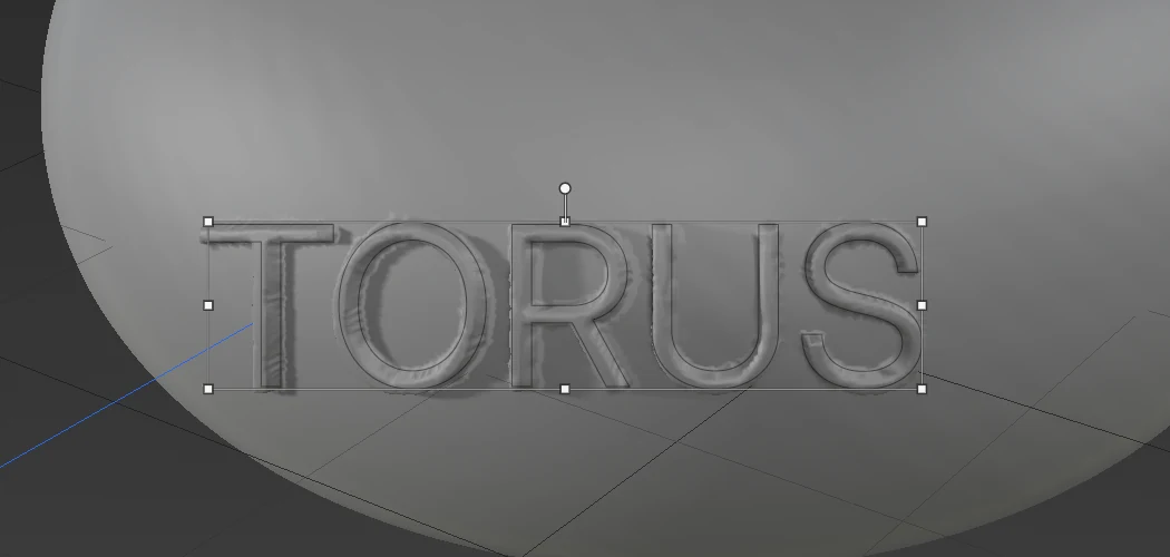
The Preview button beside Apply and Drop shows the text exactly as Apply will make it: the paint laid on the model, the letters embossed or engraved into it, or both. It isn't shown in Mesh mode, which has its own solid preview.
- Updating: when you change the words, a setting, the text's place or the view, the preview is made again a moment after you stop.
- What it keeps: nothing. Apply makes the real thing, and Drop, another tool or another tab take the preview away.
- Undo: the preview is never a step of its own; Ctrl+Z goes to your last real step.
- On a big mesh each update takes a moment.
While the preview is on, the letters are drawn as thin outlines over it.
Text styles
A text style is a saved look: the Character and Paragraph settings, the ink, and the Emboss and Mesh settings. It doesn't hold the words or where they are. The Styles row at the top of the accordion has:
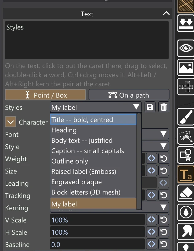
- The list: eight built-in styles, then your own below a line. Picking one lays it over the tool's defaults.
- The disk button: saves the current settings as a style under a name you type. A style of the same name is replaced.
- The bin: deletes the style you picked, after asking. Only your own styles can be deleted.
The built-in styles all use Inter Variable, which comes with Vertexix, so they look the same on any computer: Title, Heading, Body text, Caption, Outline only, Raised label (Emboss), Engraved plaque and Block letters (3D mesh). Your styles are kept in text_styles.json in your Vertexix user folder.
The tool also remembers its settings between sessions. When you pick it again, the font, sizes, ink, Emboss and Mesh settings and its switches are as you left them.
Editing on the model
You can edit live text on the model itself as well as in the text field:
- Caret: click on the text to put the caret there.
- Selecting: drag to select; double-click a word to select it.
- Moving the caret: Up and Down move it by the lines you see, wrapped lines included.
- Kerning a pair: Alt+Left and Alt+Right move the two letters on either side of the caret closer together or further apart.
With a selection, every Character change applies to the selected letters only, and the accordion says how many are selected. A mixed selection keeps what it doesn't change: making it bold leaves each part's size as it was. With nothing selected, a change applies to the whole text. Text you type takes the style of the letter before it.
Text on a path
With On a path picked, presses in the viewport lay the path's points:
- a click makes a corner;
- a drag pulls out handles for a smooth curve;
- Enter or a double-click finishes the path;
- clicking the first point again closes the path into a loop;
- Esc drops the path.
Then type, and the text runs along the path.
While the text is live, the path stays editable:
- Points: drag any point to move it.
- Handles: drag any handle to reshape the curve. Its partner turns with it, mirrored.
- Start: the yellow marker is where the text starts. Drag it along the path, or set Start in the accordion.
- Flip: puts the text on the other side of the path, running the other way.
- Frame handles: the square handles scale the path itself, and the letters keep their size.
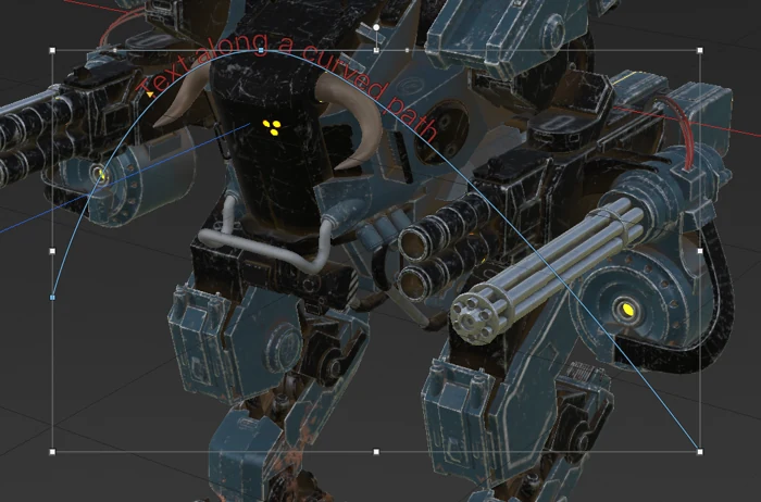
Alignment works along the path. You can edit path text on the model like any other text: click near the letters to put the caret there, drag to select, and the selection bends along the path. A click elsewhere in the path's frame moves the text instead. Path text can be painted, embossed or made into a mesh like any other text.
The Text accordion
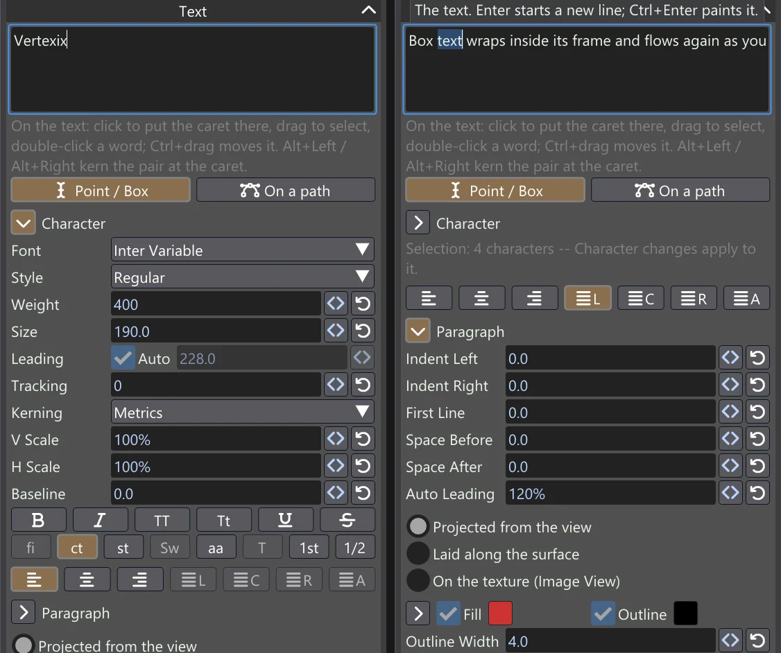
Sizes and distances are in pixels of the view at the moment you place the text, whatever the zoom; in the Image View they are in pixels of the Image View. The size you see is the size you get.
Character
| Control | What it does | Range |
|---|---|---|
| Font | The font family. The list has a search box, and it holds the fonts that come with Vertexix plus the computer's own. The computer's fonts are found in the background the first time you pick the tool, then remembered. Each name in the list is drawn in its own font, and the live text stays on the model while the list is open. Up and Down step to the previous or next font, with the list open or with the closed Font box selected, and the text changes with each step; Enter keeps the font. The default is Inter Variable, which comes with Vertexix. | |
| Style | The family's weights and italics. | |
| Weight, Width, Slant, Italic | A variable font's own settings, between its named styles. Only the ones the font has are shown. A font's optical size follows Size by itself. | The font's own |
| Size | How big the letters are (the font's em). | 4–400 |
| Leading | How far apart the lines are, baseline to baseline. With Auto ticked, it is Auto Leading (in Paragraph) times the size. | 1–800 |
| Tracking | Space added between every letter, in thousandths of the size. | −200–1000 |
| Kerning | Metrics: the font's own spacing for pairs like AV and To. Optical: each pair spaced by the shapes of its letters. This is an approximation, useful for fonts with poor kerning or for text that mixes fonts. Off: every letter at its plain width. | |
| V Scale, H Scale | The letters' height and width, as a share of the size. | 10–400% |
| Baseline | Raises the letters off the line, or lowers them below it. | −200–200 |
| The six style buttons | Faux Bold (thickens the letters, for a font with no bold of its own); Faux Italic (slants them 12 degrees); All Caps; Small Caps (the font's own small capitals when it has them, otherwise smaller capitals); Underline; Strikethrough. | |
| The eight OpenType buttons | Standard Ligatures (fi, fl as one letter), Contextual Alternates, Discretionary Ligatures, Swash, Stylistic Alternates, Titling Alternates, Ordinals (1st), Fractions (1/2). A button is greyed out when the font doesn't have the feature. |
If the font lacks a letter you type, the letter is taken from another font that has it. Chinese, Japanese and Korean come from a font included with Vertexix.
Paragraph
| Control | What it does | Range |
|---|---|---|
| The seven alignment buttons | Left, Center and Right, for any text. For box text only: Justify with the last line left, centred or right, and Justify All, which stretches the last line too. | |
| Indent Left | Moves every line in from the left. | 0–400 |
| Indent Right | Keeps every line in from the right (box text). | 0–400 |
| First Line | Moves a paragraph's first line in, or out when below 0, past the left indent. | −200–400 |
| Space Before, Space After | Space above each paragraph but the first, and below each but the last. | 0–400 |
| Auto Leading | With Leading on Auto: how far apart the lines are, as a share of the size. | 50–300% |
Where it goes, and what it paints with
Painted text uses the same three placements as Shapes:
- Projected from the view
- Laid along the surface, which wraps the text over the model's curves
- On the texture (Image View), Paint only, where you place and edit the text flat on the image
It is painted with Shapes' ink controls. Fill and Outline each have a swatch, and the chevron opens each one's own channel values. Outline Width, Softness, Bevel Width (with the Normal Map ticked) and Opacity work as they do for a shape. So text can paint a coloured, rough, raised decal in one go, on textures or on vertex colours.
The Text tool keeps its own ink settings, apart from Shapes'. The swatches start as the brush colour the first time you pick the tool.
Also sculpt (Paint tab) embosses or engraves the letters into the mesh as well as painting them. The Emboss settings (Raise / Engrave, Height, Bevel Width, Profile) appear under the tick, with the detail check. The emboss goes onto a sculpt layer of its own, as in the Sculpt tab, and one Ctrl+Z takes back both. It is the same switch as Also paint in the Sculpt tab, named for where you are. It can't be used with On the texture, which has no surface to emboss.
Text in Sculpt
In the Sculpt tab, three buttons under Point / Box and On a path choose what the text does: Mesh, Emboss or Paint. Placing and editing the text work exactly as in Paint. Ctrl+Z in the Sculpt tab takes back any of the three.
Text made in Sculpt goes onto Sculpt Layers of its own:
- Emboss or engrave: a new layer named Text: and the words, in the active Sculpt Layer. Fade, exaggerate, hide or delete the letters there later. The layer you had selected stays selected, so your next brush stroke goes where it went before.
- A text mesh: a new Sculpt Layer of its own, named the same way, which becomes the active one.
- Painted text: stays in its paint layer.
Ctrl+Z takes the layer away with the text.
Emboss and Engrave
Emboss raises the letters out of the surface, or, with Engrave, cuts them into it.
| Control | What it does | Range |
|---|---|---|
| Raise / Engrave | Letters standing up out of the surface, or cut into it. | |
| Height | How high the letters stand, or how deep they are cut, as a share of the text's size. | 0.5–50% |
| Bevel Width | How far in from each letter's edge its slope climbs to the full height (Chamfer and Round). | 0–30 px |
| Profile | The letters' edges. Flat: straight walls. Chamfer: a straight slope Bevel Width wide. Round: a rounded slope. | |
| Projected from the view | The text as you see it: every part of the model it covers that faces you is raised, or cut, exactly where the letters are drawn. | |
| Laid along the surface | The text laid round the surface from its middle, following the curves (even round a limb), so it keeps its size on a curved surface. | |
| Mirror with Symmetry | Stamps the text again through the sculpt symmetry. It is off by default, because mirrored text reads backwards. When it is on, the text is stamped flat onto the surface under its middle, so on a curve it can sit a little off where it is drawn. Text laid along the surface is never mirrored. | |
| Also paint | Paints the letters into the vertex colours as well, with the same ink as Paint (its controls appear under the tick). One Ctrl+Z takes back both the emboss and the paint. Turn on Show Vertex Colors (V) to see the paint. | |
| Refine Edge and Refine under the text | Splits the edges under the live text down to Refine Edge, so the letters have points to be made from. The new points are placed on the smooth surface the coarse mesh's shading suggests, not on its flat facets. This uses dynamic topology and is one undo step of its own. Refine first, then emboss. | 0.5–10 px |
When the mesh is too coarse
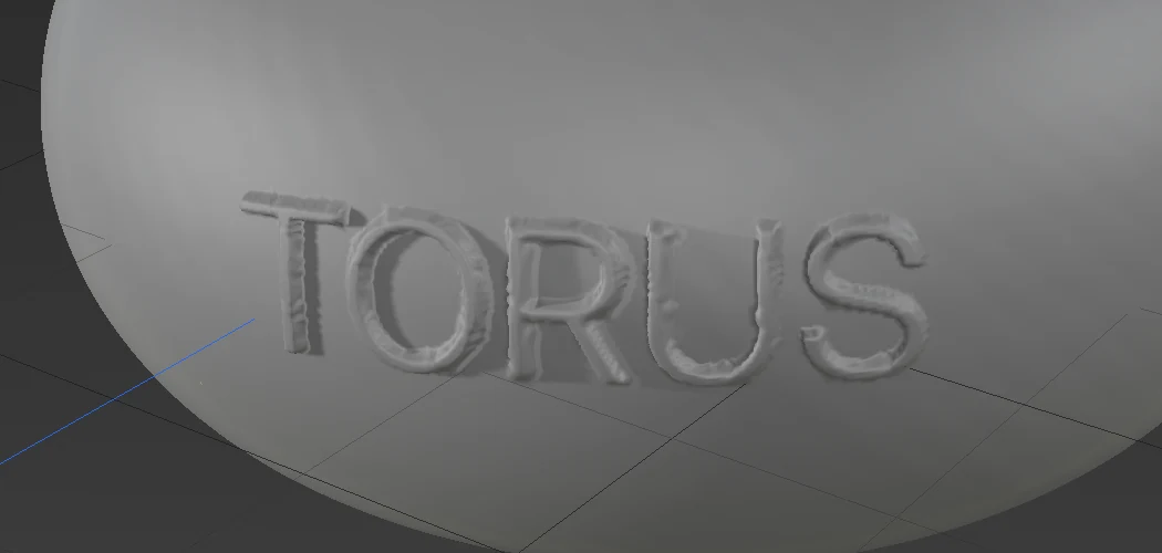
The letters can only be as fine as the mesh. An emboss moves the surface's existing points, and vertex paint colours them, so a letter's stroke needs a couple of points across it. On a coarse mesh the letters come out jagged or not at all.
While Emboss or Paint text is live, the accordion checks this for you. It measures the mesh's edges under the text and a letter's stroke, both in pixels on screen, and shows the two numbers directly under the Mesh / Emboss / Paint buttons. If the edges are longer than half a stroke, the line turns amber and says what to do:
- Subdivide (on the Generated Mesh): the button adds a subdivision level, four times the faces. Press it again until the warning clears.
- Refine under the text (on the Loaded Mesh): adds points under the letters only.
- Make the text bigger.
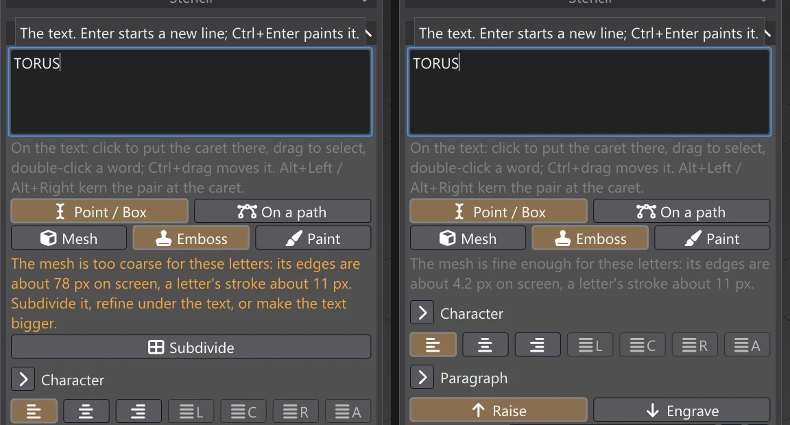
Refine works on the Loaded Mesh only. It cannot split edges that belong to a single face, so it has little to work with on a flat-shaded model or along UV seams.
Like Alpha Drag, an emboss changes only the connected piece of the model under the text's middle. On a model made of separate parts, text that spans several of them is cut into one.
3D text mesh
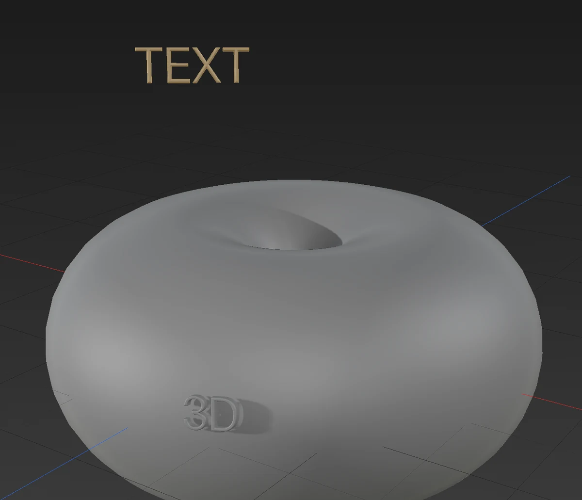
Mesh makes the letters into a solid: a new mesh in the sculpt, with its own entry in the Sculpt Tree (Text: …) and its own material. One Ctrl+Z removes it. Move, size or turn it afterwards like any other sculpt mesh.
| Control | What it does | Range |
|---|---|---|
| Depth | How thick the letters are, as a share of the text's size. | 1–200% |
| Bevel | The letters' front edges: None (square), Chamfer (cut at 45 degrees) or Round. | |
| Bevel Size | How far the bevel reaches in from each edge. | 0–30 px |
| Both faces | Bevel the back edges too. | |
| Facing the view / Lying on the surface | The letters stand facing you as you see them now, or lie on the surface under the text's middle. | |
| Sink | How far into the surface the letters are sunk, as a share of their depth. A little hides the seam where they meet it. | 0–100% |
| Mesh Edge | How long the new mesh's edges are. Smaller keeps finer letters but makes more polygons. | 0.25–10 px |
The mesh is placed where the letters' middle meets the model. Over empty space, it is placed at the depth of the view's centre.
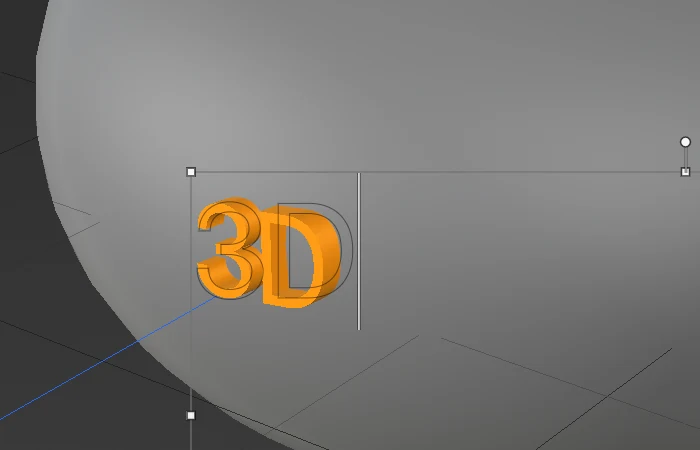
While the text is live, a solid preview of the letters is shown in the viewport, in the action colour. It is exactly where the mesh will be made, at its depth and sink, and it follows every change to the text, its place, the view and the settings. The 2D letters are drawn as thin outlines over it. The bevel isn't in the preview; it comes with the mesh.
Paint
Paint paints the text into the model's vertex colours. It uses the same ink as in the Paint tab, either projected from the view or laid along the surface. The Paint the colour switch stands in for the Paint palette's Color / Albedo tick, which isn't on view in Sculpt. Turn on Show Vertex Colors (V) to see the paint on a textured model.
The font list
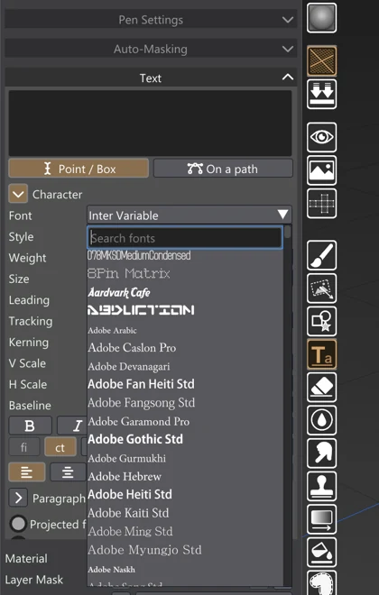
What it does not do
- No vertical text or warp. There is no vertical text and no warped text, such as arcs or flags. Use a path for curved lines.
- Simple line breaking. Lines break at spaces and hyphens, and between Chinese, Japanese and Korean characters. Text is never hyphenated.
- Colour fonts. Colour emoji are drawn as outlines, in the ink's colours.
- Text is applied once. Applied text is painted or sculpted in: it is not a text layer you can retype later. Undo it and set it again instead.
Tips
- A label that wraps round a curve: pick Laid along the surface, so the letters keep their size and shape over the curve.
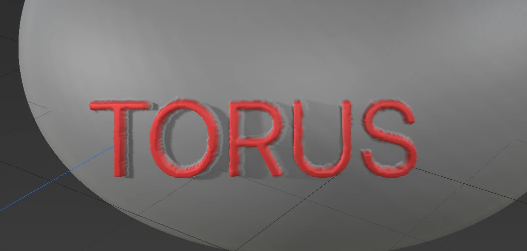
- Lettering that reads on a busy texture: tick Outline as well as Fill, as on the torus above.
- A badge with raised letters: in Paint, tick the Normal Map and give the fill a height in the channel columns. In Sculpt, emboss it after raising the subdivision level.
- Large type in a mixed or poorly kerned font: switch Kerning to Optical.